Plan India
A narrative annual report, not a compliance filing.
Art Director: Subhojit Sanyal. Designed at Storytellers, prior to the founding of Subhojit For Sale. It is not a Subhojit For Sale client engagement.
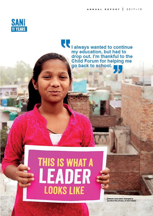
Plan India is the Indian arm of one of the world’s largest child-rights organisations, working across child protection, education, health, and water and sanitation. Their annual report had the problem every annual report has: it was two documents pretending to be one. Somewhere between “written” and “filed,” the story was getting lost.
Statutory and compliance-driven documents almost always contain real content — a chairman’s letter with an actual argument in it, a programme story worth telling, a set of numbers that mean something to the people they describe. That content sits inside production built to satisfy a regulator rather than a reader. Our approach was to stop treating the document as a single object and separate the two registers: narrative sections designed to be read, impact data designed to be scanned, statutory content present and correct but visually subordinate.
The result reads as a publication rather than a filing. A donor can open it at any spread and find a way in. A regulator can find every disclosure exactly where it should be. Those two requirements were never actually in conflict — they had simply never been designed for separately.
Art Director: Subhojit Sanyal. Designed at Storytellers, prior to the founding of Subhojit For Sale.
The case for funding, made in numbers.
The annual report answers to donors who already give. This deck had a harder job: it went to companies deciding where to place a CSR budget, most of whom knew nothing about Plan India beyond the name, and who would be looking at four other organisations the same week.
That audience does not read. It scans, and it wants to know within a slide or two whether the problem is real and whether this organisation is equipped for it. So the deck opens on the scale of the problem rather than on the organisation — child sex ratio at birth, underweight at two, mortality before five, school attendance at fourteen, marriage before eighteen. One statistic per life stage, laid out as a timeline, so a reader who takes nothing else away understands that the risk compounds with age.
The duotone treatment does something specific. Photographs of children in development communication slide easily into either pity or gloss, and both cost credibility with a corporate audience. Flattening every image to a single colour removes that register entirely — the person is present and dignified, and the number beside them carries the argument.
The client used it for years. It is the piece from this relationship they came back to most.